HomeSmart Logo Redesign
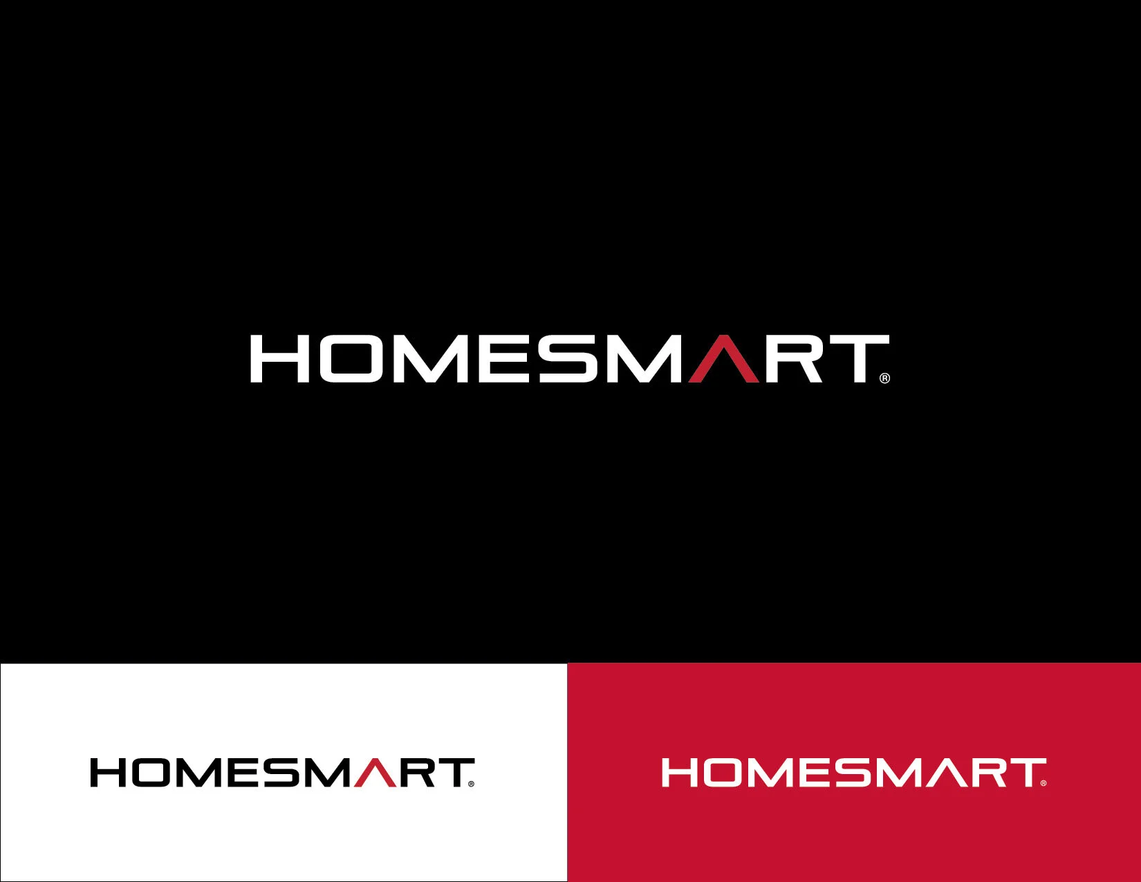
HomeSmart has been wanting to update their logo for a while now and tasked the designers with a redesign. The goal was to make the HomeSmart logo look more “tech” and less “discount”. This was the design I came up with. I used a font that felt more luxury/tech.
Instead of the HomeSmart diamond, I used the A in the word mark to symbolize both the edge of a diamond and the roof of a house. My personal goal was to simplify the logo and make it look more professional.


